This week, I listened to director Alexander Payne wax on about black & white.
In discussing his new film NEBRASKA, Payne explained that he’d always wanted to make a black & white film. He went on to underline the fact that while he’s always wanted to do one, he needed to find the right script to apply the look to. If he stripped the colour out of THE DESCENDANTS, for instance, you would lose an awful lot of what makes that film so visually splendid. Eventually though, the right project came along, and Payne was able to make a film that mirrored the sorts of films he so adores.
Payne actually had to do a bit of arm-twisting with Paramount to convince them to go for a black and white, mostly because there’s a stigma out there that audiences at-large stay away from black & white films (which isn’t entirely untrue). Payne is perplexed by this, considering that in photography, a style choice like black & white is every bit as current and fashionable as it was when photography was first invented. In the movies, it’s a whole other story. Where black and white photography can suggest something like class or elegance, black and white in a film suggests…”old”.
For over fifty years, the amount of black and white films made has dwindled…so much so, that nowadays even a mid-level black & white release is a rarity.
Why?
Audiences seem able to go along with films that use varying aspect ratios, various colour palettes, varying audio quality, and that’s not even counting the films that add 3-D as a gimmick. Somehow, a film shot presented in black & white is a tough sell, despite the fact that great television commercials and music videos still fall back on it often.
It left me to wonder, what might have been if some of this decade’s best films had of eschewed their colour palette in favour of a grayscale presentation. What feelings of nostalgia might have been sparked? What parallels to classic films might we have seen? What timeless moments might we have been treated to? When I was first getting into film, I actually experimented with watching videos in my collection with the colour turned off on my TV. You might be surprised how amazing titles like SAVING PRIVATE RYAN and RAIDERS OF THE LOST ARK look in monochrome.
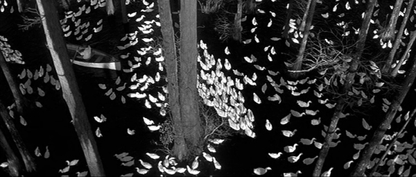
I decided to take matters into my own hands. Here are still frames from twelve films from the last fourteen years with their colour stripped away.
Take a look and imagine what might have been…


The idea that “black & white” means old also indicates an extraordinary flattening of film history, as if everything immediately started being in color as soon as it was invented. Black & white and color coexisted quite happily for close to three decades. Is Gone With the Wind (1939) new while Anatomy of a Murder (1959) is old?
It’s also interesting to me that in the ’40s and ’50s, black & white was seen as more realistic, so it was used for serious dramas and hard-hitting crime films, with color saved for fluffy musicals and comedies. Now, using black & white is a stylistic choice that tends to make the film seem less realistic. Of course, some of that is due to the softening of color palettes over the years, as the 1940s candy-colored Technicolor is hardly realistic.
I’d watch any of the films you include in black and white. 🙂 In fact, three of my top five films of this year so far are in black and white – Blancanieves, Much Ado About Nothing, and Frances Ha.
Exactly!
What about Singin’ In The Rain vs. The Apartment?
Part of my thinking behind all of this was someone recently saying to me “_____ didn’t need to be in 3-D” (I can’t recall the specific film). The person’s point being that the 3-D was underemployed as a tool. I retorted that the film also didn’t need to be in widescreen or in colour. Sometimes it feels like for every “serious drama” (good call!) that employs a specific colour palette (say A SINGLE MAN for instance), there are hundreds that just roll film and get what they get.
Next time you’re bored (right after I typed that i realized how ridiculous it was) turn down the colour on your TV and watch something new.
It’s funny that you mention this topic since I’m prepping to start a marathon of modern black-and-white films (FRANCES HA, THE WHITE RIBBON, etc.) next month. Jandy makes a good point about whether black-and-white films are truly “old”. The last John Ford film that I watched, DRUMS ALONG THE MOHAWK, was in color in 1939 and looked much older than YOUNG MR. LINCOLN from the same year.
That said, I do understand that studios are looking at reports of past releases and always focusing on the bottom line. They don’t want anything that might hinder the success of their film, unless it’s part of the appeal like THE ARTIST. They’ll pull out mixed box office for something like Good Night and Good Luck and say that it’s proof since George Clooney and Robert Downey Jr. didn’t draw big numbers. It’s a limited view point, but I think it will continue to hinder a resurgence in black-and-white films today.
If your marathon doesn’t include CONTROL, I’m never reading PTS again.
There are plenty of reasons why people didn’t pony up for GOOD NIGHT AND GOOD LUCK (all terrible reasons if you ask me), so to pin it on the film’s aesthetic is short-sighted on the studios part. Actually, even with the wonderful polish of similar entities like Mad Men and The Hour, it’s difficult for me to envision GNAGL in colour. B&W just seems to suit its story so much better considering how America consumed the messages of both Murrow and McCarthy.
Speaking of Downey, doesn’t that shot of him and Jake in Zodiac seem so natural? Like it was meant to be in B&W all along?
Well, I’ve actually already seen CONTROL, so it’s not eligible. Also, I didn’t entirely love it, but that’s for another day.
I definitely agree about ZODIAC, which already has a classic feel to it. The black and white just seals the deal.
I’m not sure if we can be friends if you didn’t totally love CONTROL…
I’ll say this about CONTROL. The black-and-white photography is stunning.
I think where B&W shines is when light is more important than color, in terms of cinematography. So a film like CHICAGO, in my opinion, is perfect for it. MEMOIRS OF A GEISHA? It would deaden the beautiful cinematography that is inextricably linked with the colourful descriptions in the novel.
Whenever I think of black and white at it’s best, for some reason my mind always goes to THE THIRD MAN, when Orson Welles just disappears into a corner of darkness, or when they’re running through the sewers. Magical.
It might deaden it and it might not. For GEISHA, think about the films of Ozu and Kurosawa and how they got so much of that era without the use of colour.
I was thinking of THE THIRD MAN as well, and thinking about how some modern “dark films” – dark in lighting, not in tone – would work well in b&w. THE DARK KNIGHT came to mind.
On a side… I’ve been in a small habit — for a while now — of using movie screenshots as my desktop background. And I tend to B&W them for the most part… films I feel have looked the best doing it:
Shutter Island
Death Proof
…
my current wallpaper is a B&W shot from THE ROYAL TENENBAUMS, this shot http://media.cinemasquid.com/blu-ray/titles/the-royal-tenenbaums/aa59fb94-59e1-4f4a-a940-34d40996e1ad/screenshot-lrg-14.png?AWSAccessKeyId=0XM9FKW8XQ7AQ6S1D302&Expires=1384967236&Signature=hfRt4dVCBpqpqnDj4GxuEdvv4R4%3D
I probably should have used SHUTTER IS instead of INCEPTION. I chose…..poorly.
Interesting choice on DEATH PRROF, I imagine that would give it something of a FASTER PUSSYCAT vibe.
The Tennenbaums image doesn’t show though – try again as now I’m interested.
http://www.cinemasquid.com/blu-ray/movies/screenshots/sets/the-royal-tenenbaums/a997e0ba-ad56-431b-8c67-57141db4e9fd/08c53a3b-66b5-497d-bb23-cd868115869b
that’s the Tenebaums shot
Oh yes – that would like sublime in B&W!
Ewww why is The Notebook there?
Jokes aside, I wish there would be more black and white films. KIFF had a separate category for modern black and white films to give a similar message and the three that I saw (Blancanieves, The Artist & Model and Jealousy) looked great. I would say of the three, only Blancanieves *needed* to be in monochrome, but the other two could might as well be in colour, but were made just that much more beautiful in black and white. I mean, Louis Garrel’s face in black and white- I could stare at it all day.
I like the films and the shots you’ve chosen. The only one I would properly disagree with is Skyfall. I think colour was an integral part of what makes that film so stunning.
The “You’ve got red on you” line in Shaun of the Dead will be really interesting if it were in black and white.
Re: The Notebook.
I wanted to include a modern romance, and since that one is set so long ago, its visuals lend itself really well to black & white. All of those scenes set at the carnival, around those shoreline houses…hell even the iconic image of Ryan and Rachel kissing…doesn’t it feel like you’ve seen black and white photos like those in old books?
As for SKYFALL – think about how amazing the beginning of CASINO ROYALE looks in b&w and then imagine an entire film with that look to it.
Frank Darabont originally wanted his 2007 Stephen King adaptation THE MIST to be released in black and white and there is even a monochrome version of the film on the DVD.
My LORD! That Skyfall picture in B&W is glorious.
Hmmm, I want a still from Joe Wright’s HANNA added in there.
How could I deny such a fitting request? Thanks for the tip – I’ve added young Hanna to the post.
I am pleased.
Not an entirely fair experiment, as there are significant differences in how the photographer lights for black and white vs. colour. In BW the shape and intensity of the highlights are used to give depth and definition to the images; in colour much of that definition is automatically supplied by the colours themselves so highlight and rim light is used more sparingly.
That’s your cinematography 201 lesson for today. #themoreyouknow #hashtags
Fun Fact: once upon a time, I planned on being a pro photographer. So in a neat little fluke, I already knew most of what you just explained. Somewhat further to that, every single one of these images took a little bit of tinkering with the curve in Photoshop to get them “just so” since – as you point out quite correctly – the depth and definition would be off if I just clicked “desaturate”.
The point was more to what Payne was saying about the imagery serving the story…and as I look back, I believe there were many more times through the years that b&w *could* have served the story.
#counterpoint
#hashtags